Posted on 24th March 2015 by Jon Terry
A new image for Wright Solutions.
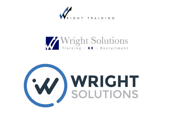
You will, we trust, have noticed that Wright Solutions has a new Logo and colours to work alongside our new and more interactive website.
We were of the opinion that the old logo didn't really convey the brand values that we wanted to get across to our clients. The colours grey and royal blue together with the serif font made Wright Solutions look a little old fashioned and if you know us then you'll know that we're not really that!
And so we asked our Brand Partners Ballyhoo to create us a brand that better reflected our character... "simple and fun but mature with a professional energy".
There are clearly some recognisable elements from the original (indeed even the very first Wright Training logo from over 15 years ago!) but there should be a "younger and hi-tech" feel to things which reflects how we continue to innovate.
The logo mark is still made up of 2 ticks but we simplified it as much as possible, so that it was strong enough to work as a standalone symbol for the business and you'll hopefully see this more and more on our Social Media outlets.
We also chose a strong san-serif font that is "modern and simple, but still sophisticated and trustworthy".
Together we feel that these changes will help Wright Solutions continue to appeal to high calibre professionals who want a bespoke service. BUT as ever we'll strive to prove ourself through excellence of service rather than over-reliance on Brand and Artwork... make sure you remind us of that if ever we get too "Young & hi-tech" for our boots!